User interface
Component overview
The UI consists of the following elements:
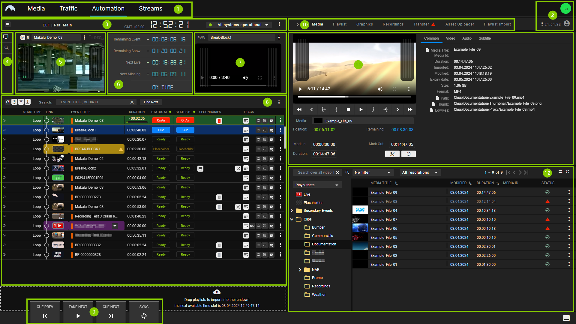
- Makalu UI main navigation
- User menu
- Channel/system information
- Preview area navigation
- Channel preview
- Time-related rundown information
- Next clip preview
- Channel rundown
- Rundown and player controls
- Collapse/expand toggle for the right side and navigation to the areas media, playlist, graphics, recordings, transfer, Asset Uploader, and playlist import
- Media asset preview and information (content varies depending on the selected navigation tab/area)
- Media asset list (content varies depending on the selected navigation tab)
View modes
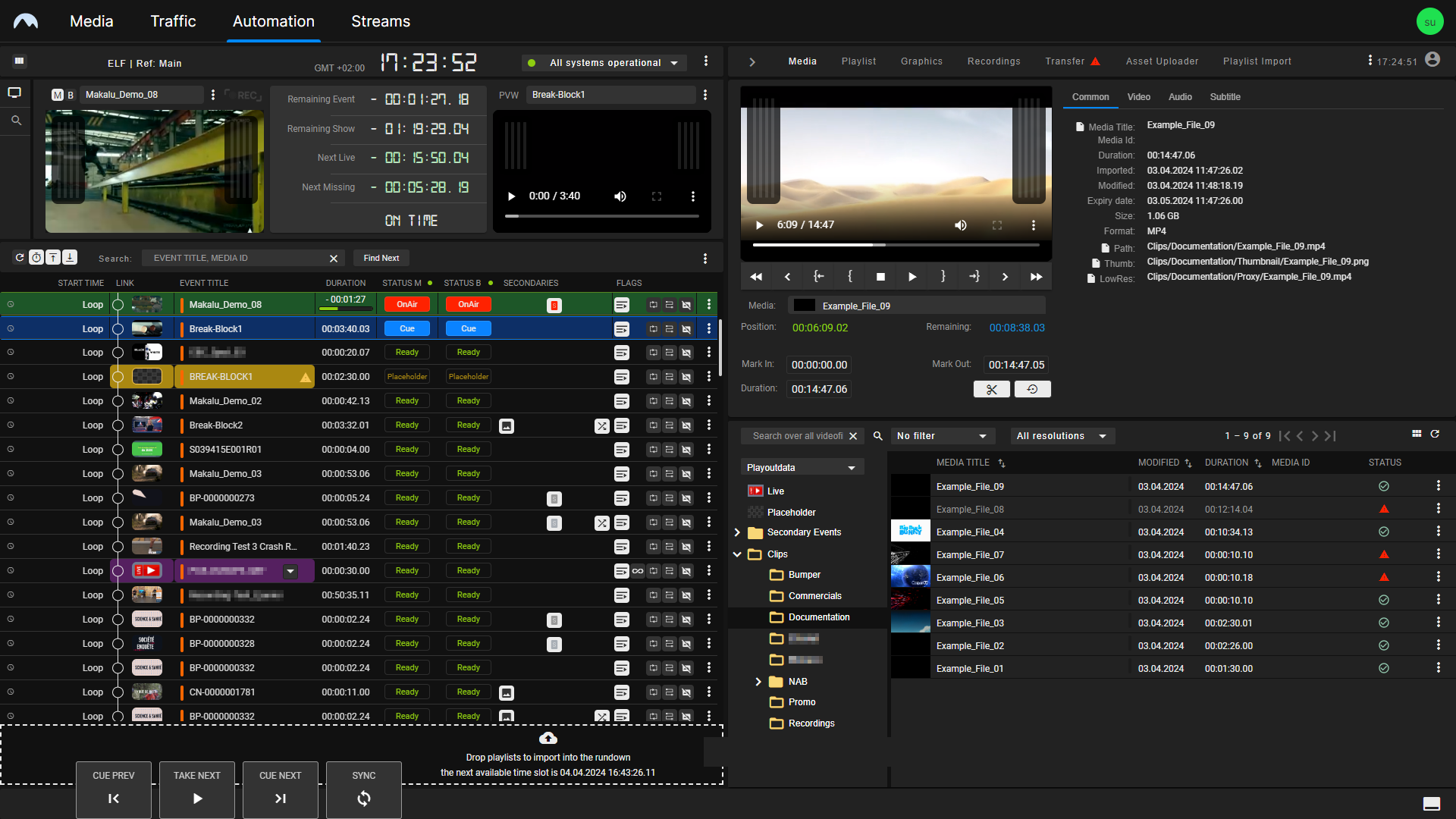
The Detailed Channel View includes two basic view modes, the "Default View" and the "Simple View", providing users/operators with different display options.
When you first open the Detailed Channel View, the Default View is enabled. It divides the view in half, creating two equal-width sides. On the left, it displays channel information, preview, and rundown. On the right, it displays all other areas (for example, media, playlist, graphics, etc.).
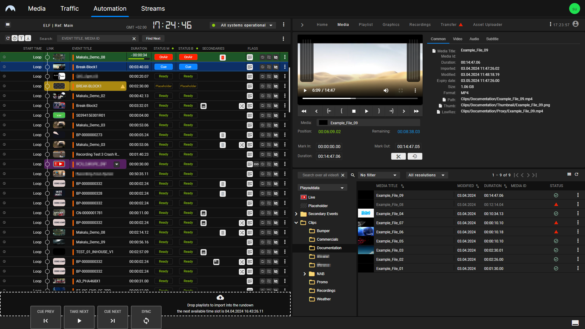
The second view mode is referred to as the "Simple View" and is more focused on the rundown. It uses all available space on the left of the screen for the rundown and displays the preview and all other areas on the right. To switch between the two views, click the User icon at the top right and select or deselect Show simple view.
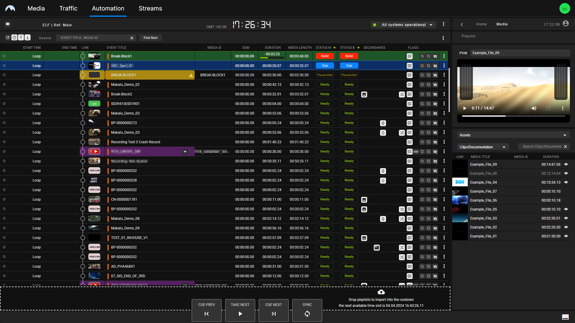
In addition, you can collapse and expand the right side by clicking the Angle icon  to the left of the Home tab. This display variant utilizes most of the screen space for the rundown on the left. It minimizes the contents of the Home, Media, and Playlist tabs on the right, creating more space for displaying additional columns in the rundown. It is therefore referred to as the "Rundown-Centric View".
Makalu UI main navigation
Via the main navigation, you can access all functional areas of Makalu at any time by clicking the corresponding tab.
Tip
You can also return to the Makalu Hub by clicking the Makalu logo at the top left.
User menu
The user menu provides the following options:
| Option | Purpose |
|---|---|
| User name | Displays the name of the user currently signed in |
| Build | Displays the build/version number of the Detailed Channel View |
| Open the documentation | Open the Makalu user manual |
| Copy API Token | Copy an API token to the clipboard (only relevant for development purposes) |
| Show simple view | Enable/disable the Simple View |
| Switch to Main/Backup | Switch the reference player |
| Logout | Log the current user out of the Makalu system |
Channel/system information
This area includes the following elements/information:

- Link to Multichannel View (only available for redundant channels)
- Channel name
- Player used as time reference (only available for redundant channels)
- On-Air Ctrl switch
- Channel local time zone
- Channel local time
- System health status indicator
- Channel actions menu
To open the Multichannel View, click the Multichannel icon  (1) on the left.
The On-Air Ctrl switch (4) is a security feature that ensures that exactly one instance of the Detailed Channel View acts as the primary UI for all changes in the rundown. For more information, see the section Requesting and transferring On Air Control.
Notice
In the current Makalu version (released starting in mid-2026) the On-Air Ctrl switch is displayed as a button instead of a toggle switch and its position has moved to the right side of the channel/system information section.

In the Detailed Channel View instance where On Air Control is enabled, the button is highlighted in blue. If On Air Control is disabled, the button is displayed in gray.
The System health status indicator (7) displays the current operating status of the most important internal system components (for example, connection to backend components and player status). The list of available components depends on the actual system configuration.
To display an expanded list of individual components, click the System status indicator.
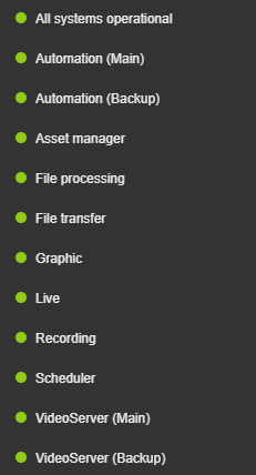
A green icon indicates that the component is running normally, while a red icon indicates an error.
Notice
In the current Makalu version (released starting in mid-2026) an extended system health monitoring is available in the Health tab. For more information, see the section Health.
The menu button (8) to the right of the system health status  provides access to the available channel actions, for example:
| Action | Purpose |
|---|---|
| Delete graphics | Remove all currently displayed graphics secondary events (applies to the main and backup player, if redundancy is enabled) Notice: This can be useful in emergency situations (for example, if a player error occurs or if graphics are not automatically removed as expected). |
| Restart main/backup player | Restart the main or backup player (requires additional confirmation via dialog) Warning: Restart the player only if there is an emergency (for example, if a player error occurs). Restarting the player takes a short amount of time. During this time, no output signal is generated. |
| Restart main/backup preview | Restart the main or backup preview component (requires additional confirmation via dialog) Notice: Manually restarting the preview is only necessary if the preview is not displayed as expected. |
| Automation | List of Automation-related components that can be restarted |
| Recording | List of Recording-related components that can be restarted |
| Streams | List of streams/endpoints that can be restarted |
The list of available actions depends on the actual system configuration.
Notice
In the current Makalu version (released starting in mid-2026) the System health status indicator (7) and the menu button (8) are available in the navigation area on the right.

Preview area navigation
The icons in the preview area navigation enable you to switch between the preview (  ) and the search/replace view (
  ). For more information about the search/replace view, see the section Searching for and replacing clips.
Channel preview
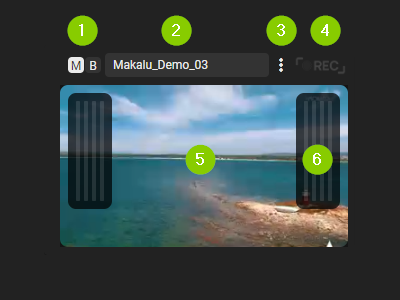
The channel preview consists of the following elements:
- Source selector
- Clip name display
- Options menu
- Recording indicator
- Preview player
- Peak audio meter
The source selector at the top left is only available for redundant channels. It enables you to select the source of the preview player below by switching between main ("M") and backup ("B"). For non-redundant channels, there is no source selector. Instead, the source display shows "PGM".
To the right of the source selector, the name of the clip currently playing is displayed.
Right beside the clip name, the following actions are available from the Options menu  :
:
| Action | Purpose |
|---|---|
| Show Main/Backup | Select the source of the preview player below (identical to the source selector) |
| Show Audio | Open the edit dialog for the clip currently playing to edit the audio mapping (for more information about how to use the audio mapping feature, see the section Audio mapping) |
| Reload preview | Reload the preview player |
In the right upper corner, the recording indicator displays "REC" if a recording is currently in progress (for example, if the clip currently playing is a live source that is being recorded).
The preview player displays a low-res version of the current player output (backchannel) in real time. It also includes a peak audio meter that supports up to eight audio tracks and indicates the current audio signal level of the channel output.
The positions of the channel preview and next clip preview are configurable. Depending on the system settings, the channel preview is displayed on the right and the next clip preview on the left (default), or vice versa.
Tip
If you want to use a rundown-focused view, you can hide this area by selecting User menu > Show simple view. As a result, the rundown list is extended to the full height of the left side.
In addition, you can collapse and expand the right side by clicking the Angle icon to the left of the media tab.
Time-related rundown information
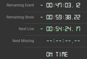
This area provides the following information:
| Element | Description |
|---|---|
| Remaining Event |
|
| Remaining Show |
|
| Next Live |
|
| Next Missing | Remaining time until the next missing element in the rundown (for example, a placeholder for which the corresponding file is not yet available) |
| On time / Overtime / Undertime |
|
Tip
If you want to use a rundown-focused view, you can hide this area by selecting User menu > Show simple view. As a result, the rundown list is extended to the full height of the left side.
In addition, you can collapse and expand the right side by clicking the Angle icon to the left of the media tab.
Next clip preview
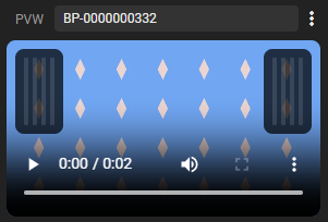
The preview player in this area can be used to display either a preview of the next clip to be played (the clip currently cued) or a preview of the backup player output/backchannel (available only for redundant channels). It is useful, for example, to preview and check a clip or a live source before it goes on-air. It also includes a peak audio meter that supports up to eight audio tracks and indicates the current audio signal level of the channel output.
Depending on the currently selected source, at the top left, either "PVW" (preview of the next cued clip) or "B" (preview of the backup player) is displayed. Using it to display the preview of the backup player allows you to preview both the main and backup players simultaneously.
To the right of the selected source, the name of the next cued clip is displayed.
Right beside the clip name display the following actions are available from the Options menu :
| Action | Purpose |
|---|---|
| Show Backup/Preview | Select the source of the preview player below |
| Reload preview | Reload the preview player |
The positions of the channel preview and next clip preview are configurable. Depending on the system settings, the channel preview is displayed on the right and the next clip preview on the left (default), or vice versa.
Tip
If you want to use a rundown-focused view, you can hide this area by selecting User menu > Show simple view. As a result, the rundown list is extended to the full height of the left side.
In addition, you can collapse and expand the right side by clicking the Angle icon to the left of the media tab.
Channel rundown
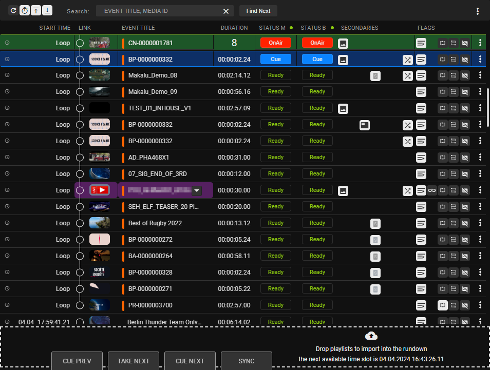
This area contains the rundown of the current channel. The rundown list contains all playlists, shows, and clips scheduled for playout. If the display of playlists and shows is enabled for this list, they can be expanded and collapsed.
Tip
To enable or disable the display of playlists and shows, use the Options menu in the toolbar above the rundown list and enable or display the options Display playlists and/or Display Shows.
You can also use this menu to enable/display additional columns. If you want to display all available columns, an ultrawide monitor is recommended. Alternatively, you can collapse the right side of the UI by clicking the Angle icon to the left of the media tab. This utilizes most of the screen space for the rundown and minimizes the preview and media areas on the right.
If a clip has assigned secondary events (for example, graphics), it can also be expanded and the corresponding secondary events are listed.
Depending on the type of the currently selected element in the rundown, the toolbar above contains the following elements:
| Icon/Element | Description |
|---|---|
 | Reload the rundown and update all clip statuses |
 | Automatically expand the rundown and jump to the section of the rundown that includes the current on-air clip every 15 seconds Tip: Deactivate this function to make changes in the rundown undisturbed. |
 | Jump to and select the previous playlist |
 | Jump to and select the next playlist |
| Search field and Find Next button | Search for clips based on their Title or Media ID and find their next (future) occurrence in the rundown Notice: This function is helpful, for example, if you want to find out when a specific clip is scheduled. Tip: If you want to check the date a specific placeholder was first used in the rundown, search for the placeholder in the media asset list in the Media tab. If you select a placeholder in this list, its first occurrence in the rundown is displayed in column First Appearance. |
 | Group selected clips (for more information, see the section Using groups) |
 | Ungroup selected clips (for more information, see the section Using groups) |
 | Move the selected clip to the top (set it as first clip of the show) (for more information, see the section Moving clips) |
 | Move the selected clip one position up (for more information, see the section Moving clips) |
 | Move the selected clip one position down (for more information, see the section Moving clips) |
 | Move the selected clip to the bottom (set it as the last clip of the show) (for more information, see the section Moving clips) |
 | Remove fixed scheduled start time from selected element (for more information, see the section Deleting a fixed start time) |
 | Add the default graphic to the selected playlist, show, or clip (for more information, see the section Assigning or removing the default graphic) |
 | Remove the default graphic from the selected playlist, show, or clip (for more information, see the section Assigning or removing the default graphic) |
 | Remove the selected playlist or clip |
 | Create a new playlist (for more information, see the section Creating a new playlist) |
| Open the options menu to access additional actions:
|
The actual rundown list includes the following information:
| Column | Description |
|---|---|
| Clock icon | Configure a fixed start time of a show/first clip of a show Depending on whether a fixed time is set or not, the clock icon is displayed as follows:
|
| Start Time | Scheduled/actual start date and time of a playlist, show, or clip Notice: Displays "Loop" if a clip is part of a group that is being looped. |
| Link | Distinguish playlists, shows, and clips, expand/collapse shows, display clip thumbnail The different types of elements are marked as follows:
|
| CAS (optional) | Cascade (A or B) to be used for playing the clip Notice: Cascades are only available if Makalu is used to control third-party playout servers (for example, EVS). In this case, it can be configured for A/A or A/B mode. As a result, Makalu plays each clip on a fixed port of the corresponding playout server that is assigned to a cascade (A or B). For example, in A/B mode the used cascades always alternate between A and B. The current clip can be played on cascade A while the next clip is already being preloaded on cascade B, the following clip again on cascade A and so on. |
| Event Title | Name of the primary or secondary event (playlist, show, or clip), indicator for grouped clips, source selection for live sources Notice: Grouped clips are highlighted with an orange indicator  (if multiple groups are used, each group is highlighted in a distinct color). (if multiple groups are used, each group is highlighted in a distinct color).Tip: For clips of type "Live", you can change the source to be used by clicking the Select source icon  and selecting the corresponding live source. and selecting the corresponding live source. |
| Media ID (optional) | Clip Media ID (either a specific ID or, in the case of a live clip, the name of the selected live source) Tip: This column is hidden by default. You can display it by enabling it in the Options menu in the toolbar above the rundown. |
| Duration | Total playlist, show, clip duration, and remaining time of show/clip currently playing (incl. playback progress bar and countdown during the last 10 seconds before a clip change) Tip: To open the Edit clip menu, click the Duration field of the corresponding clip. |
| Status | Clip status, possible values:
|
| Secondaries | Indicates if there are secondary events assigned to the show or clip The secondary event types are distinguished by the following icons:
on the right and selecting Edit Secondary. |
| Flags | Clip flags that define how each clip should be played |
| Open the options menu for accessing additional actions Depending on the selected element the available actions are:
|
 Small gray clock icon - show/first clip of a show does not have a fixed start time
 Large white clock icon - show/first clip of a show has a fixed start time
 /
/  Circle with arrow icon - Show collapsed/expanded
 Circle icon - Clip
 Warning icon - Gap (orange highlights a gap between shows, white between playlists)
 - Graphics
 - Recording
 - Script
 - Splicing
 - Subtitle
 - Routing
 - Audio Mapping
Secondary events assigned to a clip are listed with the following information:
| Column | Description |
|---|---|
| Start-Offset | Offset until the secondary event is triggered (based on the start of the corresponding clip) |
| Type | Type of the secondary event (for example, Singular.Live graphics, Splicing, Script) |
| Title | Title of the secondary event |
| Duration | Duration of the secondary event |
| Flags | Delete button for removing the secondary event from the clip |
Depending on the type of the primary event and/or the severity level, the following highlight (row background) colors and icons are used in the rundown:
| Color | Icon | Primary event type/severity level |
|---|---|---|
 Yellow Yellow |  | Placeholder |
 Purple Purple | Live | |
 Red Red | Missing | |
 Orange Orange | Gap | |
 Green Green | On air | |
 Blue Blue | Cued |
The duration of a primary event is also highlighted in different colors, depending on whether the duration corresponds to the physical media length or is set shorter/longer. In this case, the following colors are used in the duration field:
| Color | Duration |
|---|---|
 White White | Set duration corresponds exactly to the physical media length |
| Yellow | Set duration is shorter than the physical media length |
| Red | Set duration is longer than the physical media length (also applies to live elements with activated Open End flag) |
Tip: Resetting the duration of an event
If the set duration of a primary event is either shorter or longer than the physical media length, and you want to reset the duration to the exact physical media length, use the Options menu on the right of the event row and select Fix duration. In the following dialog, you can decide whether you want to reset the duration only for the selected clip or for all occurrences of the clip (that reference the same media asset) across all shows and playlists currently in the rundown.
Below the rundown list, a dropzone is available for adding playlists to the rundown via drag and drop.

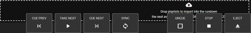
Rundown and player controls
Via the rundown and player controls, you can manually trigger actions to control the player(s) of the corresponding channel. The behavior of the controls is customizable. By default, the actions are triggered immediately when you click the corresponding button. There is an optional security feature, that, if enabled, highlights the selected action first and requires you to confirm it with an additional click.
The rundown and player controls provide the following actions:
| Action | Description |
|---|---|
| Cue Prev | Prepare the previous clip for playback |
| Take Next | Start the playback of the currently prepared/cued clip |
| Cue Next | Either prepare the first clip in the rundown for playback (if no clip is currently cued) or prepare the next clip after the currently cued clip for playback |
| Sync | Synchronize rundown and player Notice: This action should only be used if an error occurs, if rundown and player are not synchronized as expected. |
| Uncue | Uncue the clip currently cued |
| Stop | Stop the playback of the clip currently playing |
| Eject | Stop playback and eject player (set to idle) |
Notice
The control buttons on the left are always displayed by default. The buttons on the right are hidden by default and can be manually displayed. If these buttons are not displayed, you can display them by clicking the Show controls icon  at the bottom right of the screen. To hide these buttons, click the Hide controls icon
  at the bottom right of the screen.
Warning
In environments where Makalu controls third-party playout servers, it is important not to trigger a switch to the next clip manually shortly before the current clip ends. Otherwise, this may cause the system to enter an inconsistent state, because time-specific commands for the next clip may already be in preparation.
To prevent this and to warn operators, a red countdown indicator is usually displayed as a progress bar on the Take Next button during the final seconds of the currently playing clip. The progress bar counts down backwards within a configurable time (default: 5 seconds) before the clip ends.

Do not click the Take Next button if the countdown indicator is displayed!
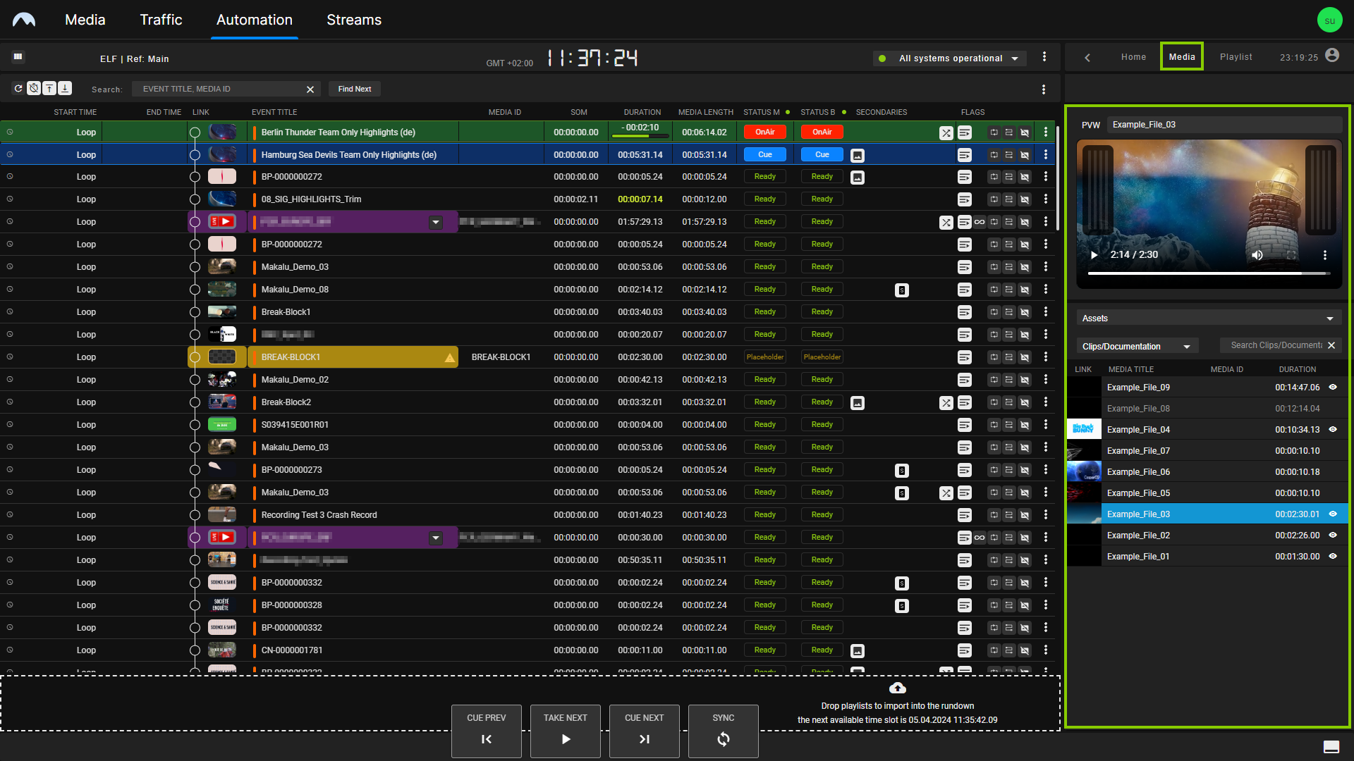
Media
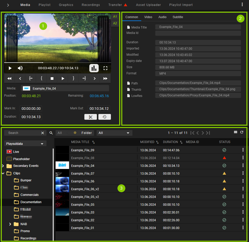
The Media tab contains the following elements:
-
Media asset preview
-
Media asset metadata
-
List of available media assets
The preview player provides the following controls:
| Icon | Description |
|---|---|
 | Fast rewind |
 | Previous frame |
 | Jump to mark in |
 | Set mark in |
 | Stop |
 | Play |
 | Set mark out |
 | Jump to mark out |
 | Next frame |
 | Fast forward |
 | Mute/unmute audio, set volume level |
 | Hide/show peak audio meter |
 | Change playback speed |
 | Enable/disable full-screen playback |
 | Mute/unmute audio channel |
Below the player controls the following time-related information of the file currently being previewed is displayed:
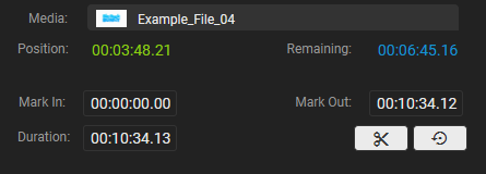
| Element/Icon | Description |
|---|---|
| Media/thumbnail with file name | Draggable element for adding the media asset to a show in the rundown, including the currently set mark in and mark out timecodes |
| Position | Current playback timecode |
| Remaining | Remaining playback duration |
| Mark In | Mark in timecode |
| Mark Out | Mark out timecode |
| Duration | Total media asset duration |
 | Create a reusable segment from the selected media asset by applying the currently set mark in and mark out timecodes (for more information, see the section Creating media segments and adding them to the rundown) |
 | Save changed mark in and mark out points of the selected segment |
 | Reset mark in and mark out points of the selected segment |
 | Load the parent asset of the selected segment into the preview player |
To the right of the player window, the technical metadata of the file currently being previewed is listed. This section is divided into the tabs Common, Video, Audio, Subtitle/CC, and Segments.
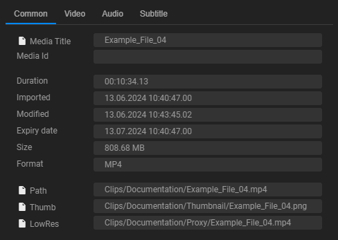
Tip
If a Copy icon  is displayed on the left of a metadata item, you can copy its value to the clipboard by clicking the corresponding icon. You can paste it, for example, into the search field above the rundown to search for specific clips based on their Title or Media ID.
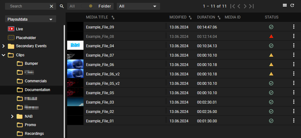
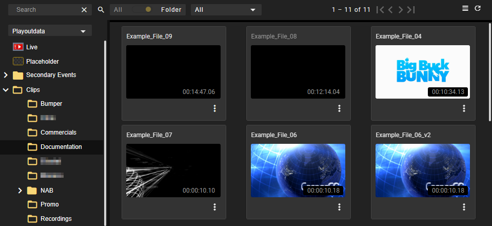
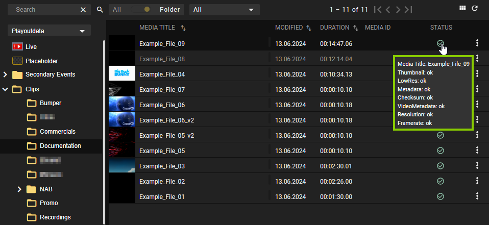
Below the preview player and the time-related information, the media asset list is displayed. Depending on the selected entry in the Source dropdown menu at the top left, this section lists either all files available on the ingest storage or on the playout nodes that are assigned to the currently selected channel. By default, the "table view" is enabled for the media asset list.
Alternatively, the media asset list also provides the "grid view". It displays each media asset with a large thumbnail image and the duration as an overlay. You can switch between both modes using the view switch  /
/  at the top right above the media asset list.
Tip
While the grid view is enabled, you can preview available live sources by selecting Live as asset type and hovering your mouse over the corresponding live source thumbnail image.
The toolbar of the media asset list contains the following elements:
| Icon/Element | Name | Description |
|---|---|---|
 | Select source | The source of the media assets to be displayed in the media asset list Available options are:
Notice: The status of file transfers from the central storage to the local storage of the playout nodes can be seen from the colored bar on the right-hand side of the Media Title column of the corresponding file. The colors correspond to the following statuses:
|
 | Title filter | Search media assets of the currently selected type (Live, Placeholder, Secondary Events, or Clips) based on their Title or Media ID |
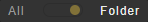 | Title filter folder toggle | Search for the term entered in the title filter either only in the currently selected folder (default, if the toggle is set to Folder) or in all available folders (if the toggle is set to All) (only available if asset type Clips is selected) |
 | Live source type filter | Filter the available live sources based on their type (only available if asset type Live is selected) Available options are:
|
| Live source channel toggle | Switch between all available live sources of the selected type (default) and channel-specific live sources of the selected type |
| Live source connection status toggle | Switch between all available live sources of the selected type and connected live sources (default) of the selected type |
 | Time filter | Filter the displayed media assets based on the date they were imported into the system Available options are:
|
| / | View switch | Switch between table view (enabled by default) and grid view Notice: The view switch is only available in the view modes "default" and "simple". It is not available in the "Rundown-Centric View". |
 | Reload assets | Refresh the media asset list |
If you select a media asset, different columns and metadata are displayed in the list, depending on the selected type.
Tip
Some of the columns in the list are sortable. You can sort a column by clicking the Sort icon  to the right of the corresponding column title.
Tip
The thumbnail image to the left of the Event Title column is marked with CC if subtitles were uploaded for the selected file. If you preview such a file, you can select the subtitle language to be used or enable/disable the subtitle display by clicking the CC icon in the preview player and selecting the corresponding option.
Media assets for which reusable segments have already been created are recognizable by the total number of created segments displayed in the SEG column. For more information about creating segments, see the section Creating media segments and adding them to the rundown.
The Status column provides an aggregation of several statuses for each file that includes checks of thumbnail, proxy file, metadata, checksum, video metadata, resolution, and framerate. It either displays a green checkmark or a red warning sign, depending on whether all checks were successful or if an error occurred.
Tip: Displaying a detailed status list
You can display a detailed status list by hovering your mouse over the displayed Status icon.
The following actions are available from the Options menu on the right of each row in the list:
| Action | Purpose |
|---|---|
| Preview asset | Open the selected asset in the preview player (available for media items of type live, placeholder, and clip) Tip: Placeholders cannot be played back because they are virtual assets. Opening a placeholder in the preview player displays the metadata of the corresponding asset. This enables you, for example, to copy the Title or Media ID of the selected placeholder asset to the clipboard and paste it into the search field above the rundown. This way you can find all occurrences of the asset in the rundown. Tip: If you hover your mouse over the Path metadata item, the full file path is displayed which indicates where the corresponding file is expected. |
| Delete placeholder | Delete the selected asset (only available for media items of type placeholder) |
| Re-process asset | Trigger a full file processing again for the selected file (only available for media items of type clip) and afterward, trigger file transfer from ingest storage to playout nodes again Tip: This can be useful if there is a problem with a file (for example, a proxy file does not exist), which is indicated by a red warning sign in the Status column. |
| Re-process thumb | Trigger the file processing again only for the thumbnail image of the selected file (only available for media items of type clip) |
| Upload asset | Trigger file transfer from central ingest storage to local playout node storage (only available for media items of type clip) Notice: The transfer is only executed if a file change is detected on the central storage that deviates from the file on the local storage (based on the file checksum). |
| Request media | Request initial or renewed transfer of the corresponding file from a connected MAM (Media Asset Management) system to the ingest storage (only available for media items of type placeholder when the system is connected to an external MAM) Notice: This function can also be triggered in the Missing assets menu as described in section Searching for and requesting missing media. |
If the Rundown-Centric View is enabled, the Media tab is minimized on the right.
In this display variant, the media information displayed is reduced to a minimum, and the preview player provides basic preview functionality. Media type and folders can be selected from corresponding dropdown menus. Media items can be added to the rundown in the same way as in the default or Simple View mode (for more information, see the section Adding media to the rundown). This also applies to replacing a clip in the rundown with another media item (for more information, see the section Replacing a clip with another media item).
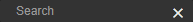
Playlist
The Playlist tab contains all available playlists of the current channel. Each playlist can be expanded to list all included components (shows, clips, secondary events, and metadata). See the section Schedule for information about how to create playlists.
The toolbar at the top contains the following elements:
| Element/Icon | Description |
|---|---|
 | Search for a playlist by title |
 | Number of playlists to display |
 | Filter the displayed playlists based on their scheduled airtime Available options:
|
 | Add the selected playlist to the rundown The position/time where the playlist is added to the rundown depends on the following:
|
 | Delete the selected playlist |
 | Reload the list of available playlists |
The list of playlists includes the following information:
| Column | Description |
|---|---|
| Expand the playlist to display a list of included shows, and expand further to display a list of clips included in a show |
| Sched | If enabled, the playlist can be added to the rundown using its planned start time as a fixed time (for more information, see the description of the playlist toolbar) |
| Type | Icon of the corresponding type of rundown element:
|
| Title | Playlist/show title |
| Rev | Playlist revision Depending on whether a playlist is used in the rundown, the revision number is highlighted as follows:
Tip: You can jump/scroll to the corresponding playlist in the rundown by clicking the highlighted revision number. |
| Scheduled time | Planned start time of the playlist |
| Duration | Playlist duration |
| Created | Playlist creation date and time |
| Pro | Indicates if the playlist is protected. If enabled (recognizable by the Protected icon  ), the playlist cannot be automatically deleted by housekeeping. ), the playlist cannot be automatically deleted by housekeeping. |
| Channel | Name of the playout channel for which the playlist was created or "Global" if the playlist is not assigned to a playout channel (for example, if the playlist was not created in Makalu Traffic but imported from a connected NRCS (Newsroom Computer System) and no channel is specified) |
 - Playlist
 - Show
 Not highlighted - the playlist is not used in the rundown
 Highlighted with gray background color - the latest version of the playlist is used in the rundown, and no update is available
 Highlighted with yellow background color - an older version of the playlist is used in the rundown, but can be updated to the latest version
Tip
Some of the columns in the list are sortable. You can sort a column by clicking the Sort icon to the right of the corresponding column title.
If the Rundown-Centric View is enabled, the Playlist tab is minimized on the right.
In this display variant, the playlist information displayed in the list is reduced to a minimum. Details of a selected playlist are displayed below the list. Playlists can be added to the rundown in the same way as in the default or Simple View mode (for more information, see the section Adding an existing playlist to the rundown). This also applies to updating a playlist (for more information, see the section Updating a playlist). As playlists cannot be expanded when the Rundown-Centric View is enabled, only entire playlists can be added to the rundown, but not selected individual elements/clips used in a playlist.
Graphics
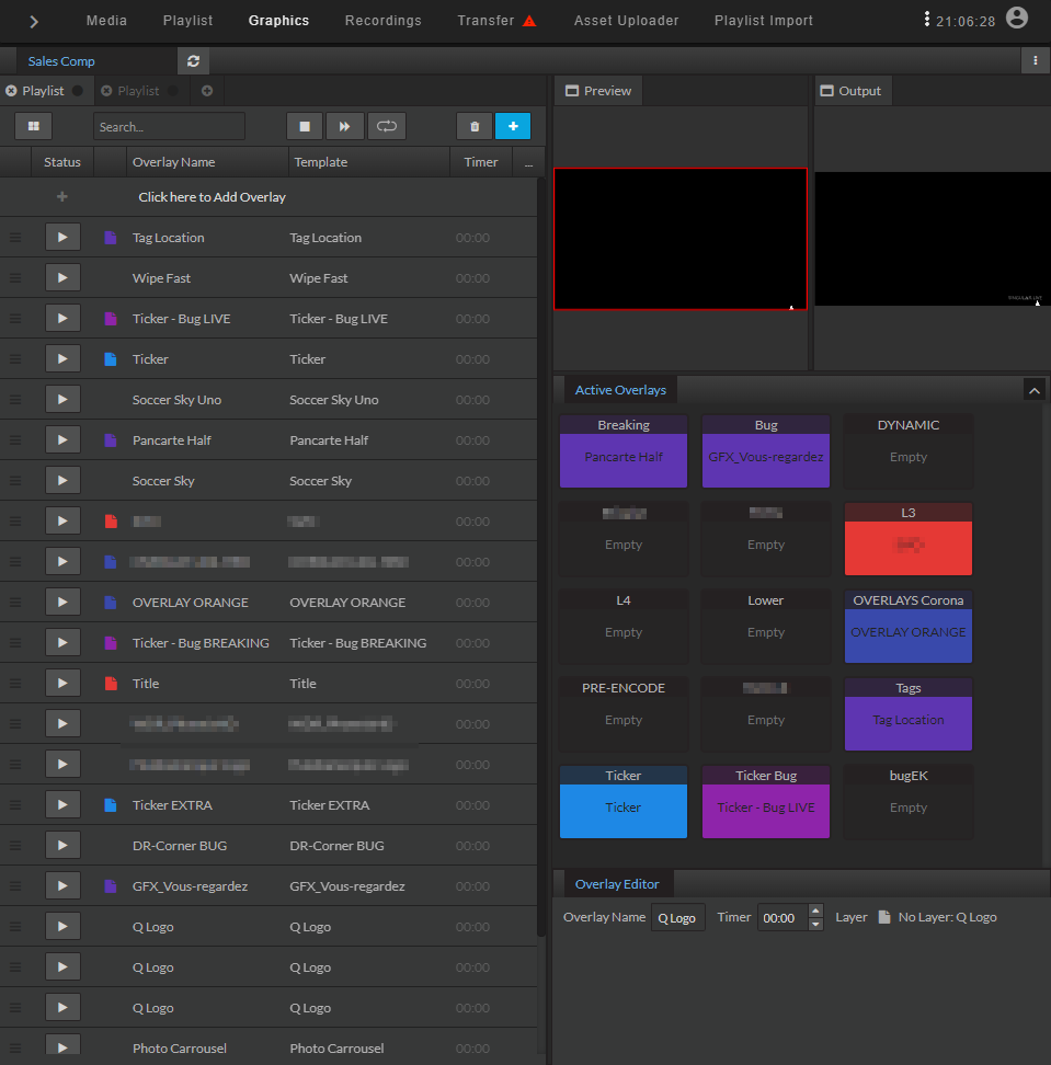
The Graphics tab includes an embedded version of the Singular.Live composition dashboard, allowing you to manually trigger Singular.Live graphics for the current channel directly from within Makalu Automation.
For more information about how to use graphics, see the Graphics section.
Recordings
Notice
The Recordings tab and the corresponding secondary event type listed under Media > Secondary Events > Recordings are only available if the optional Makalu Recording module is enabled for the currently selected playout channel. For more information, see the section Recording.
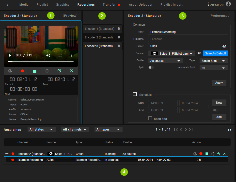
The Recordings tab provides a list of current recording jobs and enables you to create new recording jobs. For more information about how to create recordings, see the section Recording.
The tab contains the following areas:
-
Job list - List of current recording jobs
-
Job filter - Options for filtering the job list based on the job status and type
-
Job list controls - Controls for creating/deleting a recording job and refreshing the job list
-
Recording job - A single recording job, listed with job properties and controls
In the job list, the following information and controls are displayed for each job:
| Element | Description |
|---|---|
| Title | Title of the recording job |
| Type | Type of the recording job (event, crash, schedule, or recurring); for more information, see the section Recording job types |
| Status | Status of the recording job |
| Start time | Start time of the recording job |
| Duration | Duration of the recording job Notice: A duration can only be displayed if the corresponding live primary event to be recorded has a scheduled end time. If the Open End flag is enabled for the event, there is no duration to be displayed. |
| Action | Available actions for the recording job (start, stop, cancel, and delete using the corresponding action button; info and delete from the Options menu ) |
While a recording job is being processed, which is indicated by the status Running, a progress bar is displayed in the background of the corresponding job list item.
When creating a recording job manually using the Create button above the job list, the Create recording jobs menu opens, which provides the following job properties:
Notice
The create button is only available if the optional feature for manually creating recording jobs is enabled. It is part of the Makalu Recording module and can be disabled, for example, if event-based recording should be the only available type of recording. In this case, the Create button is not available.
Notice
The available properties depend on the recording job type (Crash, Schedule, or Recurring) that you select at the top of this menu.
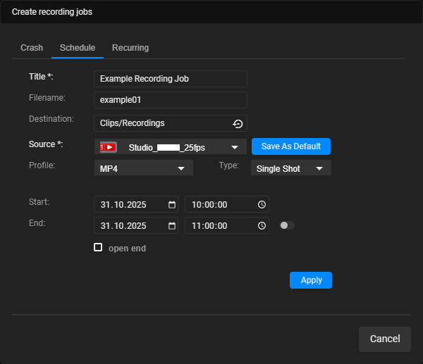
| Name | Description |
|---|---|
| The following properties are available for all recording job types | |
| Title | Title of the recording job |
| Filename | Name of the file to be recorded Notice: If no file name is provided, the title is used as the file name. |
| Destination | Destination folder where to store the recorded file |
| Source | Source stream (live source) to be recorded |
| Save As Default | Set the currently selected source as the default source |
| Profile | Format/recording profile of the file to be recorded Notice: The list of available profiles contains all profiles supported by the corresponding recording unit. |
| Type | Type of the recording job, available options:
|
| The following properties are only available for scheduled recording jobs | |
| Start | Start date and time of the scheduled recording job |
| End | End date and time of the scheduled recording job |
| Duration | Duration of the scheduled recording job Notice: The duration is only available if the toggle switch next to the end time is enabled. |
| Open end | If enabled, a scheduled recording job without an end time is created, which must be stopped manually |
| The following properties are only available for recurring recording jobs | |
| Start date | Start date and time of the validity period of the recurring job |
| End date | End date and time of the validity period of the recurring job |
| Recurring | Weekdays for which to create a recurring recording job (either daily or one or multiple specific weekdays) |
| Start | Start time of the recurring recording job |
| End | End time of the recurring recording job |
Transfer
In the Transfer tab, all file transfers from the central ingest storage to playout nodes are listed, that are currently running or were recently finished. It also provides an overview of file processing jobs. When a file transfer or processing job is currently in progress or has ended with an error, the corresponding status icon is displayed to the right of the corresponding tab name (Main, Backup, File processing, and Transfer).
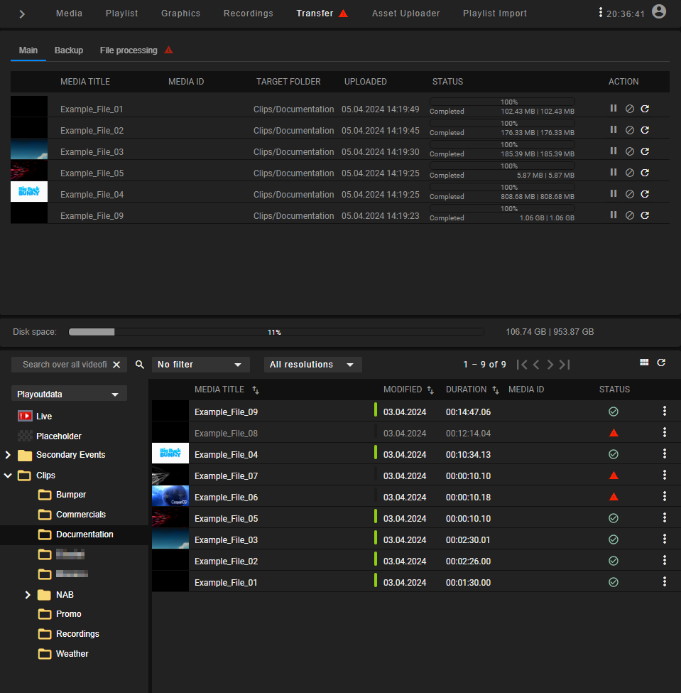
For redundant channels, two tabs at the top left of this area enable you to select either the Main or Backup playout node (for non-redundant channels, only one tab is displayed for the main channel). Depending on your selection, the file transfers for that node are displayed. The number in brackets beside the playout node name indicates the number of file transfers to this node that are currently running. The columns of the list provide details about each file and the transfer progress.
The action column provides the following elements:
| Icon/Element | Description |
|---|---|
 | Pause file transfer |
 | Cancel file transfer |
 | Retry/re-trigger file transfer |
Below the transfer list, in the Disk space area, the available storage space of the selected playout node is displayed.
For information about how to trigger a file transfer manually, see the section File transfer.
The File processing tab at the top left of this area displays a list of file processing jobs that are currently running or were recently finished. When a file is uploaded to the central ingest storage, a corresponding file processing job is automatically created and added to the list.
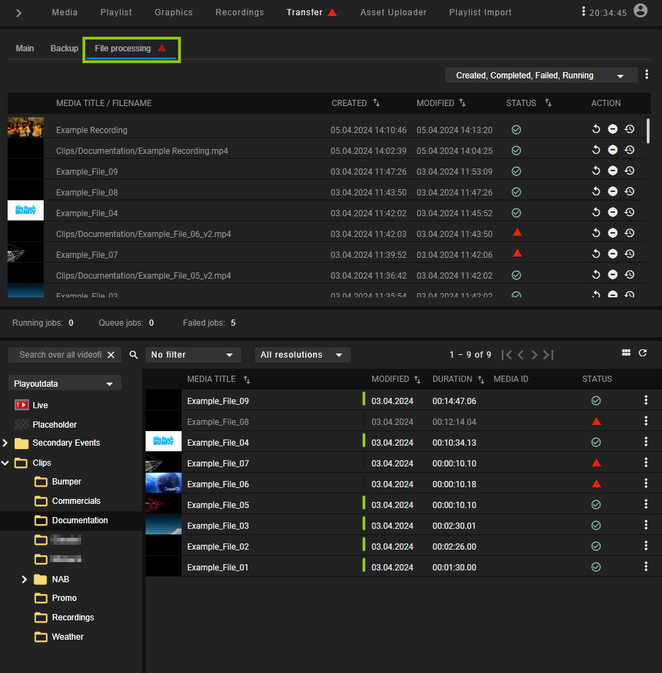
Via the dropdown menu above the file processing list, you can filter the list by job status (created, completed, failed, and/or running). Right beside the dropdown menu, there is an options menu with additional display options for the file processing list. The columns of the list provide details about each file processing job.
During file processing, a progress bar is displayed for each job, showing the current processing phase (download, pre-processing, processing, or post-processing).
A file processing job can have one of the following statuses:
| Icon | Description |
|---|---|
 | Processing successfully completed |
| Processing is currently in progress |
 | Error during processing |
Tip
You can display additional status details by hovering your mouse over the corresponding status icon.
The action column provides the following elements:
| Icon/Element | Description |
|---|---|
 | Restart complete file processing |
 | Cancel file processing |
 | Restart file processing for selected files (available options: checksum, low-res proxy, and/or thumbnail) |
Below the file processing list, additional statistics are displayed (running jobs, queued jobs, and failed jobs).
For information about how to trigger a file processing manually, see the section File processing.
At the bottom of the Transfer tab, the media asset list is displayed. This is the same list with the identical functionality as in the Media tab.
Asset Uploader
The Asset Uploader tab integrates the functionality of the Asset Uploader into the Makalu Automation UI.
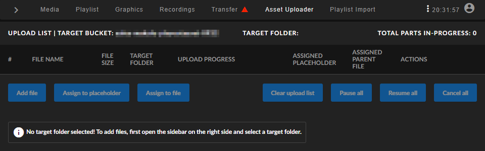
For information about how to use the Asset Uploader, see the section Ingest.
Playlist Import
The Playlist Import tab enables you to import XML-based playlists created by Makalu or by third-party traffic systems.
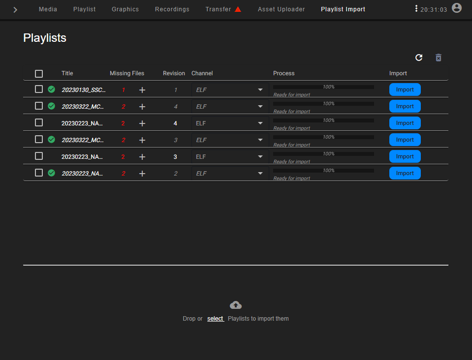
The list of imported playlists provides the following information:
| Column | Description |
|---|---|
| Title | Name/title of the playlist |
| Missing Files | Number of files missing on the ingest storage Notice: For each imported playlist, a missing file list is created. This list includes all files that are used in the imported playlist but are not yet available on the ingest storage. For each of these files, a placeholder asset is automatically created, so that the playlist can already be used in a rundown. Notice: Missing file lists can also be exported. For more information, see the section Exporting a missing file list. |
| Revision | Playlist revision number (each time a playlist with the same name/title is imported, the revision number is increased) |
| Channel | Target channel |
| Process | Progress/status of the playlist processing/import |
| Import | Start the playlist import |
For more information, see the section Importing a playlist.
Health
The Health tab provides an overview of the current health status of the Makalu system/backend components (APIs and services).
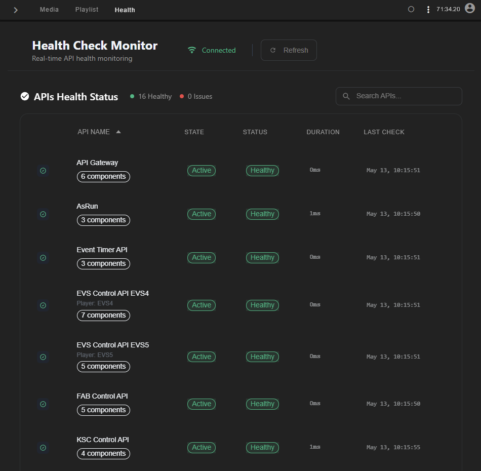
For more information, see section System health and monitoring.
Service Control
The Service Control tab allows authorized users to restart Makalu system components in the event of an error.
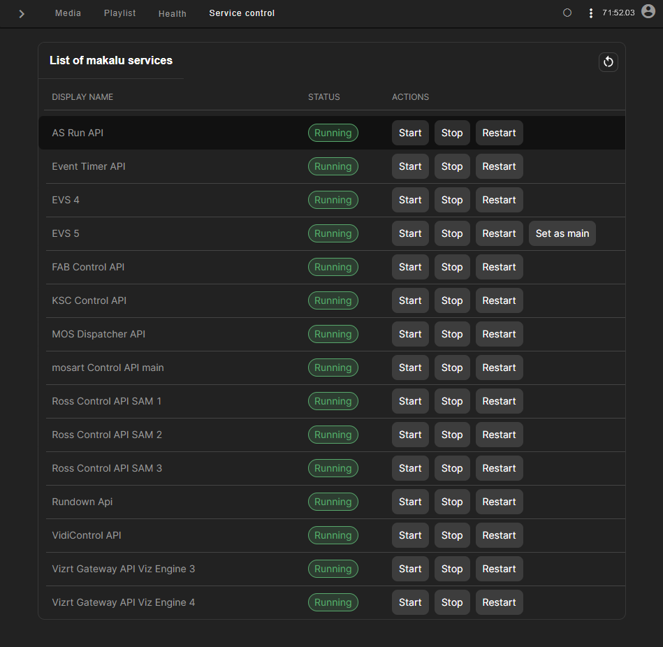
For more information, see section System health and monitoring.